// Social app UI
Pinterest-Style App UI Design in Expo
Mosaic is an original visual discovery app with the layout people search for when they want a Pinterest-style UI: a two-column masonry feed, category chips, pin detail, search and saved boards.
- Screens
- 4
- Built with
- Expo SDK 58
- Fonts
- System font
- License
- Free (MIT)
Mosaic Discovery app screens
Masonry home feed
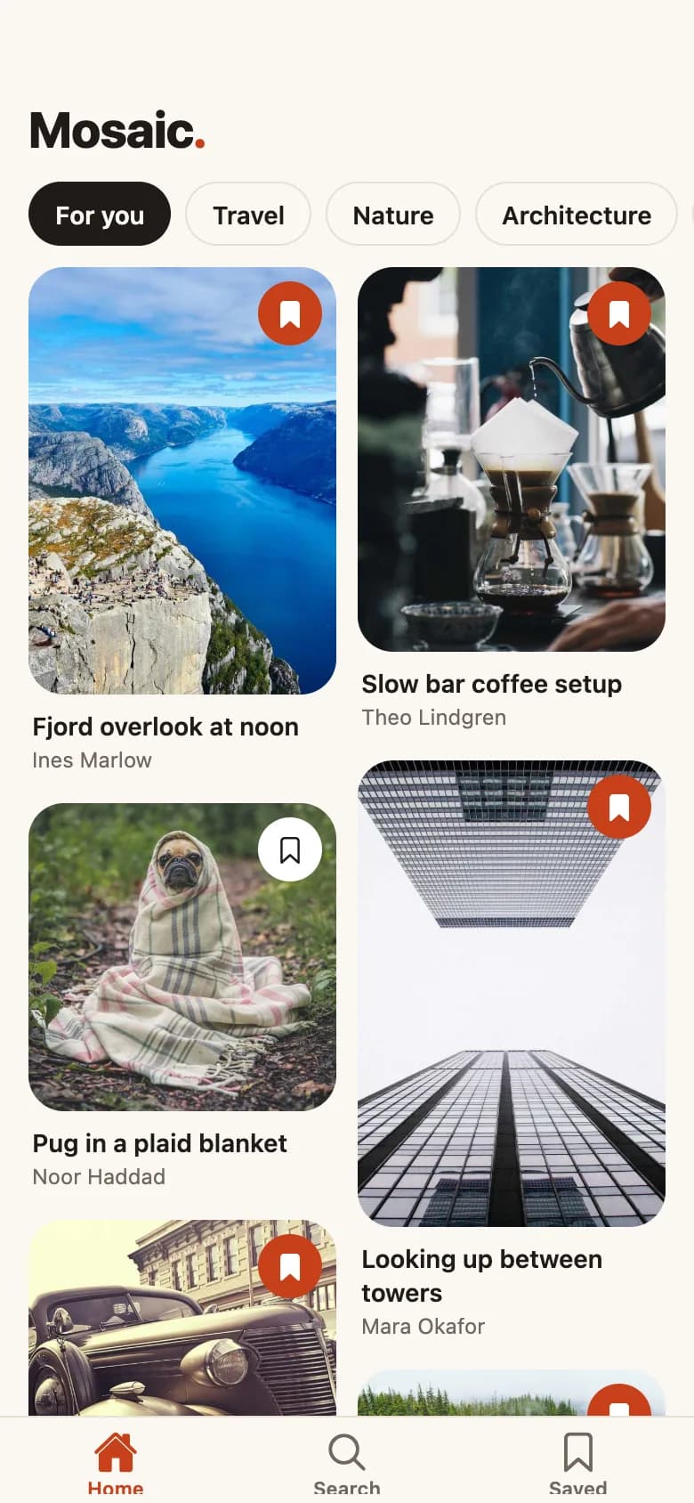
Category chips above a two-column masonry grid. Every pin has a bookmark that fills when saved.
Pin detail
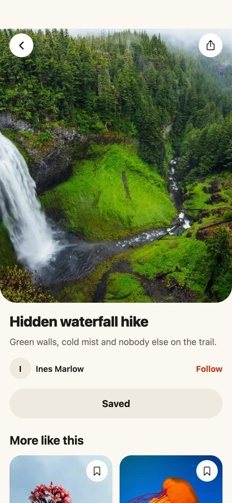
A rounded hero image with back and share actions, author row, follow toggle, save button and a More like this grid.
Search and topics
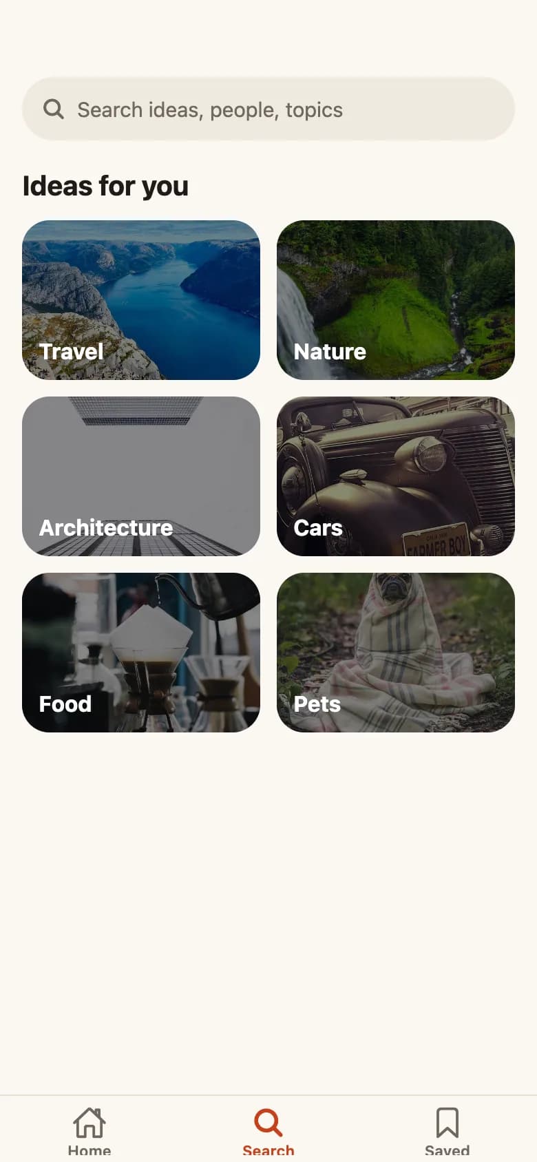
A pill search field over topic tiles. Typing swaps to live masonry results, with an empty state when nothing matches.
Saved boards
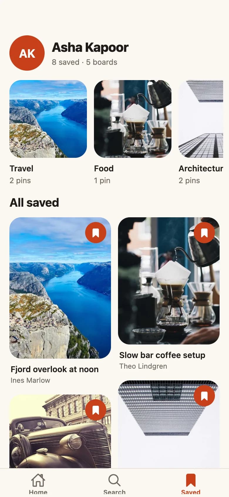
Profile header, horizontal boards built from saved categories, and every saved pin in one masonry grid.
Copy the Mosaic Discovery kit
Use the artifact as a design brief, the skill to generate the UI with an AI agent, or the code to run it right away.
Design artifact
The full design: tokens, screens and source
# Mosaic Discovery: design artifact

Mosaic is an original visual discovery app with the layout people search for when they want a Pinterest-style UI: a two-column masonry feed, category chips, pin detail, search and saved boards.

- Type: Social mobile app UI
- Screens: 4
- Artboard: 390 × 844
- Target: Expo SDK 58, Expo Router, TypeScript, @expo/vector-icons, @shopify/flash-list, expo-image
- Live page: https://developermill.com/app-designs/pinterest-style-app-ui-design

## Design direction

Warm paper tones and a persimmon accent let photography lead, with soft rounded image cards in a two-column masonry grid.

- Two-column masonry feed on FlashList v2
- Saved pins grouped into boards automatically
- Live search with a real empty state
- Light and dark themes from one token file

## Foundations

### Colour

| Token | Hex |
| --- | --- |
| Persimmon | `#C8401A` |
| Paper | `#FAF7F2` |
| Ink | `#1E1B18` |
| Stone | `#6F675D` |
| Sand | `#EFE9DF` |
| Night | `#141210` |

### Typography

- Typefaces: System font
- Common sizes (px): 11, 12, 14, 15, 20, 24, 28

### Shape and depth

- Common corner radii (px): 12, 20, 28, 999
- Shadows: `None. Depth comes from image cards.`

## Screens

### 1. Masonry home feed

Category chips above a two-column masonry grid. Every pin has a bookmark that fills when saved.

Preview: https://developermill.com/app-designs/pinterest-style-app-ui-design/feed.webp

### 2. Pin detail

A rounded hero image with back and share actions, author row, follow toggle, save button and a More like this grid.

Preview: https://developermill.com/app-designs/pinterest-style-app-ui-design/pin.webp

### 3. Search and topics

A pill search field over topic tiles. Typing swaps to live masonry results, with an empty state when nothing matches.

Preview: https://developermill.com/app-designs/pinterest-style-app-ui-design/search.webp

### 4. Saved boards

Profile header, horizontal boards built from saved categories, and every saved pin in one masonry grid.

Preview: https://developermill.com/app-designs/pinterest-style-app-ui-design/saved.webp

## Design tokens in code

```ts
import { useColorScheme } from 'react-native';

const light = {
  background: '#FAF7F2',
  surface: '#FFFFFF',
  surfaceMuted: '#EFE9DF',
  text: '#1E1B18',
  textMuted: '#6F675D',
  border: '#E6DFD3',
  accent: '#C8401A',
  onAccent: '#FFFFFF',
};

const dark: typeof light = {
  background: '#141210',
  surface: '#211E1A',
  surfaceMuted: '#2C2823',
  text: '#F5F0E8',
  textMuted: '#A99F92',
  border: '#37322B',
  accent: '#FF8A5C',
  onAccent: '#1E1B18',
};

export const space = { xs: 4, sm: 8, md: 12, lg: 16, xl: 24 };
export const radius = { sm: 12, md: 20, lg: 28, pill: 999 };

export type Theme = typeof light;

export function useTheme(): Theme {
  return useColorScheme() === 'dark' ? dark : light;
}
```

## Data model

```ts
export const CATEGORIES = ['Travel', 'Nature', 'Architecture', 'Cars', 'Food', 'Pets'] as const;

export type Category = (typeof CATEGORIES)[number];

export type Pin = {
  id: string;
  title: string;
  description: string;
  category: Category;
  author: string;
  /** Width divided by height. Drives the masonry rhythm, so vary it. */
  ratio: number;
  uri: string;
};
```
SKILL.md
Save as .claude/skills/pinterest-style-app-ui/SKILL.md
---
name: pinterest-style-app-ui
description: Build the Mosaic Discovery mobile app UI in Expo React Native. Use when asked to create a Pinterest style app UI or a new screen in this visual style.
---

# Mosaic Discovery app UI

Build this UI in an Expo SDK 58 app with Expo Router and strict TypeScript. Match the spec below rather than inventing a new look. The finished reference lives at https://developermill.com/app-designs/pinterest-style-app-ui-design

## Visual direction

Warm paper tones and a persimmon accent let photography lead, with soft rounded image cards in a two-column masonry grid.

Keep these signature details:

- Two-column masonry feed on FlashList v2
- Saved pins grouped into boards automatically
- Live search with a real empty state
- Light and dark themes from one token file

## Set up

```bash
npx expo install @expo/vector-icons @shopify/flash-list expo-image
```

## Tokens

| Token | Hex |
| --- | --- |
| Persimmon | `#C8401A` |
| Paper | `#FAF7F2` |
| Ink | `#1E1B18` |
| Stone | `#6F675D` |
| Sand | `#EFE9DF` |
| Night | `#141210` |

- Typefaces: System font
- Common sizes (px): 11, 12, 14, 15, 20, 24, 28
- Common corner radii (px): 12, 20, 28, 999

Define these once and reuse them. Do not add new colours.

## Screens

Build one Expo Router route per screen, in this order:

1. **Masonry home feed**: Category chips above a two-column masonry grid. Every pin has a bookmark that fills when saved.
2. **Pin detail**: A rounded hero image with back and share actions, author row, follow toggle, save button and a More like this grid.
3. **Search and topics**: A pill search field over topic tiles. Typing swaps to live masonry results, with an empty state when nothing matches.
4. **Saved boards**: Profile header, horizontal boards built from saved categories, and every saved pin in one masonry grid.

## Build rules

- Design on a 390 × 844 artboard, then scale to the device width so layouts match on every phone.
- Load each custom font weight by its own family name with expo-font. Do not rely on `fontWeight` with custom fonts.
- Draw icons, charts and illustrations with react-native-svg rather than image files or chart libraries.
- Use `Pressable` with an `accessibilityLabel` for every icon-only control, and keep touch targets at 44 px or larger.
- Wire navigation with `router.navigate`, and keep sample data in constants at the top of each file so it is easy to replace.
- Use expo-image for photos, with `contentFit` set explicitly.

## Done when

- Every screen above exists as a route and they link together.
- Colours, type and radii match the tokens exactly.
- `npx tsc --noEmit` and `npx expo lint` both pass.
- Layouts hold up on small and large phones.
Set up the project
npx create-expo-app@latest pinterest-style-app --template default
cd pinterest-style-app
rm -rf src
npx expo install @expo/vector-icons @shopify/flash-list expo-image
src/app/_layout.tsx
import { DarkTheme, DefaultTheme, Stack, ThemeProvider } from 'expo-router';
import { StatusBar } from 'expo-status-bar';
import { useColorScheme } from 'react-native';

import { useTheme } from '@/lib/theme';

export default function RootLayout() {
  const scheme = useColorScheme();
  const theme = useTheme();
  const base = scheme === 'dark' ? DarkTheme : DefaultTheme;

  return (
    <ThemeProvider
      value={{
        ...base,
        colors: { ...base.colors, background: theme.background, card: theme.background },
      }}>
      <StatusBar style="auto" />
      <Stack screenOptions={{ headerShown: false }}>
        <Stack.Screen name="(tabs)" />
        <Stack.Screen name="pin/[id]" />
      </Stack>
    </ThemeProvider>
  );
}
src/app/(tabs)/_layout.tsx
import { Ionicons } from '@expo/vector-icons';
import { Tabs } from 'expo-router/js-tabs';

import { useTheme } from '@/lib/theme';

export default function TabsLayout() {
  const theme = useTheme();

  return (
    <Tabs
      screenOptions={{
        headerShown: false,
        tabBarActiveTintColor: theme.accent,
        tabBarInactiveTintColor: theme.textMuted,
        tabBarLabelStyle: { fontSize: 11, fontWeight: '600' },
        tabBarStyle: { backgroundColor: theme.background, borderTopColor: theme.border },
      }}>
      <Tabs.Screen
        name="index"
        options={{
          title: 'Home',
          tabBarIcon: ({ focused, color, size }) => (
            <Ionicons name={focused ? 'home' : 'home-outline'} color={color as string} size={size} />
          ),
        }}
      />
      <Tabs.Screen
        name="search"
        options={{
          title: 'Search',
          tabBarIcon: ({ focused, color, size }) => (
            <Ionicons name={focused ? 'search' : 'search-outline'} color={color as string} size={size} />
          ),
        }}
      />
      <Tabs.Screen
        name="saved"
        options={{
          title: 'Saved',
          tabBarIcon: ({ focused, color, size }) => (
            <Ionicons name={focused ? 'bookmark' : 'bookmark-outline'} color={color as string} size={size} />
          ),
        }}
      />
    </Tabs>
  );
}
src/app/(tabs)/index.tsx
import { useState } from 'react';
import { StyleSheet, Text, View } from 'react-native';
import { useSafeAreaInsets } from 'react-native-safe-area-context';

import { CategoryChips } from '@/components/category-chips';
import { PinMasonry } from '@/components/pin-masonry';
import { pinsInCategory, type Category } from '@/lib/pins';
import { space, useTheme } from '@/lib/theme';

export default function HomeScreen() {
  const theme = useTheme();
  const insets = useSafeAreaInsets();
  const [category, setCategory] = useState<Category | null>(null);

  return (
    <View style={[styles.screen, { paddingTop: insets.top, backgroundColor: theme.background }]}>
      <View style={styles.header}>
        <Text style={[styles.brand, { color: theme.text }]}>
          Mosaic<Text style={{ color: theme.accent }}>.</Text>
        </Text>
      </View>
      <View>
        <CategoryChips selected={category} onSelect={setCategory} />
      </View>
      <PinMasonry key={category ?? 'all'} pins={pinsInCategory(category)} />
    </View>
  );
}

const styles = StyleSheet.create({
  screen: { flex: 1 },
  header: { paddingHorizontal: space.lg, paddingTop: space.sm, paddingBottom: space.md },
  brand: { fontSize: 28, lineHeight: 34, fontWeight: '800', letterSpacing: -0.6 },
});
src/app/(tabs)/saved.tsx
import { Image } from 'expo-image';
import { useMemo } from 'react';
import { ScrollView, StyleSheet, Text, View } from 'react-native';
import { useSafeAreaInsets } from 'react-native-safe-area-context';

import { PinMasonry } from '@/components/pin-masonry';
import { PINS, type Pin } from '@/lib/pins';
import { useSavedIds } from '@/lib/saved-pins';
import { radius, space, useTheme } from '@/lib/theme';

function groupByCategory(pins: Pin[]) {
  const boards = new Map<string, Pin[]>();
  pins.forEach((pin) => boards.set(pin.category, [...(boards.get(pin.category) ?? []), pin]));
  return [...boards].map(([name, items]) => ({ name, items }));
}

export default function SavedScreen() {
  const theme = useTheme();
  const insets = useSafeAreaInsets();
  const savedIds = useSavedIds();
  const pins = useMemo(() => PINS.filter((pin) => savedIds.has(pin.id)), [savedIds]);
  const boards = groupByCategory(pins);

  const header = (
    <View>
      <View style={styles.profile}>
        <View style={[styles.avatar, { backgroundColor: theme.accent }]}>
          <Text style={[styles.avatarLabel, { color: theme.onAccent }]}>AK</Text>
        </View>
        <View>
          <Text style={[styles.name, { color: theme.text }]}>Asha Kapoor</Text>
          <Text style={[styles.meta, { color: theme.textMuted }]}>
            {pins.length} saved · {boards.length} boards
          </Text>
        </View>
      </View>

      {boards.length > 0 && (
        <ScrollView
          horizontal
          showsHorizontalScrollIndicator={false}
          contentContainerStyle={styles.boards}>
          {boards.map((board) => (
            <View key={board.name} style={styles.board}>
              <Image
                source={board.items[0].uri}
                contentFit="cover"
                style={[styles.cover, { backgroundColor: theme.surfaceMuted }]}
              />
              <Text numberOfLines={1} style={[styles.boardName, { color: theme.text }]}>
                {board.name}
              </Text>
              <Text style={[styles.meta, { color: theme.textMuted }]}>
                {board.items.length} {board.items.length === 1 ? 'pin' : 'pins'}
              </Text>
            </View>
          ))}
        </ScrollView>
      )}

      {pins.length > 0 && <Text style={[styles.heading, { color: theme.text }]}>All saved</Text>}
    </View>
  );

  return (
    <View style={[styles.screen, { paddingTop: insets.top, backgroundColor: theme.background }]}>
      <PinMasonry
        pins={pins}
        header={header}
        empty={
          <View style={styles.empty}>
            <Text style={[styles.emptyTitle, { color: theme.text }]}>Nothing saved yet</Text>
            <Text style={[styles.emptyBody, { color: theme.textMuted }]}>
              Tap the bookmark on any pin and it will show up here.
            </Text>
          </View>
        }
      />
    </View>
  );
}

const styles = StyleSheet.create({
  screen: { flex: 1 },
  profile: {
    flexDirection: 'row',
    alignItems: 'center',
    gap: space.md,
    paddingHorizontal: 6,
    paddingTop: space.md,
    paddingBottom: space.lg,
  },
  avatar: { width: 60, height: 60, borderRadius: 30, alignItems: 'center', justifyContent: 'center' },
  avatarLabel: { fontSize: 20, fontWeight: '700' },
  name: { fontSize: 22, lineHeight: 28, fontWeight: '800', letterSpacing: -0.3 },
  meta: { marginTop: 2, fontSize: 13, lineHeight: 18 },
  boards: { gap: space.md, paddingHorizontal: 6, paddingBottom: space.lg },
  board: { width: 132 },
  cover: { width: 132, height: 132, borderRadius: radius.md },
  boardName: { marginTop: space.sm, fontSize: 14, lineHeight: 19, fontWeight: '600' },
  heading: {
    paddingHorizontal: 6,
    paddingBottom: space.md,
    fontSize: 20,
    lineHeight: 26,
    fontWeight: '700',
  },
  empty: { alignItems: 'center', paddingTop: 48, paddingHorizontal: space.xl },
  emptyTitle: { fontSize: 17, fontWeight: '700' },
  emptyBody: { marginTop: space.xs, fontSize: 14, lineHeight: 20, textAlign: 'center' },
});
src/app/(tabs)/search.tsx
import { Ionicons } from '@expo/vector-icons';
import { Image } from 'expo-image';
import { useState } from 'react';
import { Pressable, ScrollView, StyleSheet, Text, TextInput, View } from 'react-native';
import { useSafeAreaInsets } from 'react-native-safe-area-context';

import { PinMasonry } from '@/components/pin-masonry';
import { CATEGORIES, pinsInCategory, searchPins } from '@/lib/pins';
import { radius, space, useTheme } from '@/lib/theme';

export default function SearchScreen() {
  const theme = useTheme();
  const insets = useSafeAreaInsets();
  const [query, setQuery] = useState('');
  const searching = query.trim().length > 0;

  return (
    <View style={[styles.screen, { paddingTop: insets.top, backgroundColor: theme.background }]}>
      <View style={[styles.field, { backgroundColor: theme.surfaceMuted }]}>
        <Ionicons name="search" size={18} color={theme.textMuted} />
        <TextInput
          value={query}
          onChangeText={setQuery}
          placeholder="Search ideas, people, topics"
          placeholderTextColor={theme.textMuted}
          accessibilityLabel="Search pins"
          returnKeyType="search"
          autoCorrect={false}
          style={[styles.input, { color: theme.text }]}
        />
        {searching && (
          <Pressable accessibilityLabel="Clear search" hitSlop={10} onPress={() => setQuery('')}>
            <Ionicons name="close-circle" size={18} color={theme.textMuted} />
          </Pressable>
        )}
      </View>

      {searching ? (
        <PinMasonry
          pins={searchPins(query)}
          empty={
            <View style={styles.empty}>
              <Text style={[styles.emptyTitle, { color: theme.text }]}>Nothing for “{query.trim()}”</Text>
              <Text style={[styles.emptyBody, { color: theme.textMuted }]}>
                Try a broader word, or browse a topic instead.
              </Text>
            </View>
          }
        />
      ) : (
        <ScrollView showsVerticalScrollIndicator={false} contentContainerStyle={styles.topics}>
          <Text style={[styles.heading, { color: theme.text }]}>Ideas for you</Text>
          <View style={styles.grid}>
            {CATEGORIES.map((category) => (
              <Pressable
                key={category}
                accessibilityRole="button"
                accessibilityLabel={`Search ${category}`}
                onPress={() => setQuery(category)}
                style={styles.tile}>
                <Image source={pinsInCategory(category)[0].uri} contentFit="cover" style={styles.tileImage} />
                <View style={styles.tileScrim} />
                <Text style={styles.tileLabel}>{category}</Text>
              </Pressable>
            ))}
          </View>
        </ScrollView>
      )}
    </View>
  );
}

const styles = StyleSheet.create({
  screen: { flex: 1 },
  field: {
    height: 46,
    marginHorizontal: space.lg,
    marginTop: space.sm,
    marginBottom: space.md,
    paddingHorizontal: 14,
    borderRadius: radius.pill,
    flexDirection: 'row',
    alignItems: 'center',
    gap: space.sm,
  },
  input: { flex: 1, height: '100%', fontSize: 15 },
  topics: { paddingHorizontal: space.lg, paddingBottom: space.xl },
  heading: { fontSize: 20, lineHeight: 26, fontWeight: '700', marginTop: space.sm, marginBottom: space.md },
  grid: { flexDirection: 'row', flexWrap: 'wrap', gap: space.md },
  tile: { flexBasis: '47%', flexGrow: 1, height: 116, borderRadius: radius.md, overflow: 'hidden' },
  tileImage: { ...StyleSheet.absoluteFill },
  tileScrim: { ...StyleSheet.absoluteFill, backgroundColor: 'rgba(0,0,0,0.46)' },
  tileLabel: {
    position: 'absolute',
    left: space.md,
    bottom: space.md,
    color: '#FFFFFF',
    fontSize: 16,
    fontWeight: '700',
  },
  empty: { alignItems: 'center', paddingTop: 64, paddingHorizontal: space.xl },
  emptyTitle: { fontSize: 17, fontWeight: '700', textAlign: 'center' },
  emptyBody: { marginTop: space.xs, fontSize: 14, lineHeight: 20, textAlign: 'center' },
});
src/app/pin/[id].tsx
import { Ionicons } from '@expo/vector-icons';
import { Image } from 'expo-image';
import { router, useLocalSearchParams } from 'expo-router';
import { useState } from 'react';
import { Pressable, Share, StyleSheet, Text, View } from 'react-native';
import { useSafeAreaInsets } from 'react-native-safe-area-context';

import { PinMasonry } from '@/components/pin-masonry';
import { PressScale } from '@/components/press-scale';
import { getPin, relatedPins } from '@/lib/pins';
import { toggleSaved, useSavedIds } from '@/lib/saved-pins';
import { radius, space, useTheme } from '@/lib/theme';

export default function PinScreen() {
  const theme = useTheme();
  const insets = useSafeAreaInsets();
  const { id } = useLocalSearchParams<{ id: string }>();
  const savedIds = useSavedIds();
  const [following, setFollowing] = useState(false);
  const pin = getPin(id);

  if (!pin) {
    return (
      <View style={[styles.missing, { backgroundColor: theme.background }]}>
        <Text style={[styles.title, { color: theme.text }]}>Pin not found</Text>
        <Pressable accessibilityRole="button" onPress={() => router.back()}>
          <Text style={[styles.followLabel, { color: theme.accent }]}>Go back</Text>
        </Pressable>
      </View>
    );
  }

  const saved = savedIds.has(pin.id);

  const header = (
    <View style={styles.detail}>
      <View>
        <Image
          source={pin.uri}
          contentFit="cover"
          transition={200}
          style={[styles.hero, { aspectRatio: pin.ratio, backgroundColor: theme.surfaceMuted }]}
        />
        <View style={[styles.toolbar, { top: insets.top + space.sm }]}>
          <PressScale
            accessibilityRole="button"
            accessibilityLabel="Go back"
            onPress={() => router.back()}
            style={[styles.iconButton, { backgroundColor: theme.surface }]}>
            <Ionicons name="chevron-back" size={20} color={theme.text} />
          </PressScale>
          <PressScale
            accessibilityRole="button"
            accessibilityLabel="Share this pin"
            onPress={() => Share.share({ message: `${pin.title} on Mosaic` })}
            style={[styles.iconButton, { backgroundColor: theme.surface }]}>
            <Ionicons name="share-outline" size={19} color={theme.text} />
          </PressScale>
        </View>
      </View>

      <View style={styles.body}>
        <Text style={[styles.title, { color: theme.text }]}>{pin.title}</Text>
        <Text style={[styles.description, { color: theme.textMuted }]}>{pin.description}</Text>

        <View style={styles.authorRow}>
          <View style={[styles.avatar, { backgroundColor: theme.surfaceMuted }]}>
            <Text style={[styles.avatarLabel, { color: theme.text }]}>{pin.author[0]}</Text>
          </View>
          <Text numberOfLines={1} style={[styles.author, { color: theme.text }]}>
            {pin.author}
          </Text>
          <Pressable
            accessibilityRole="button"
            accessibilityState={{ selected: following }}
            hitSlop={8}
            onPress={() => setFollowing((value) => !value)}>
            <Text style={[styles.followLabel, { color: theme.accent }]}>
              {following ? 'Following' : 'Follow'}
            </Text>
          </Pressable>
        </View>

        <PressScale
          accessibilityRole="button"
          accessibilityState={{ selected: saved }}
          onPress={() => toggleSaved(pin.id)}
          style={[styles.save, { backgroundColor: saved ? theme.surfaceMuted : theme.accent }]}>
          <Text style={[styles.saveLabel, { color: saved ? theme.text : theme.onAccent }]}>
            {saved ? 'Saved' : 'Save to board'}
          </Text>
        </PressScale>

        <Text style={[styles.heading, { color: theme.text }]}>More like this</Text>
      </View>
    </View>
  );

  return (
    <View style={[styles.screen, { backgroundColor: theme.background }]}>
      <PinMasonry key={pin.id} pins={relatedPins(pin)} header={header} />
    </View>
  );
}

const styles = StyleSheet.create({
  screen: { flex: 1 },
  missing: { flex: 1, alignItems: 'center', justifyContent: 'center', gap: space.sm },
  detail: { marginHorizontal: -10 },
  hero: { width: '100%', maxHeight: 460, borderBottomLeftRadius: radius.lg, borderBottomRightRadius: radius.lg },
  toolbar: {
    position: 'absolute',
    left: space.lg,
    right: space.lg,
    flexDirection: 'row',
    justifyContent: 'space-between',
  },
  iconButton: { width: 40, height: 40, borderRadius: 20, alignItems: 'center', justifyContent: 'center' },
  body: { paddingHorizontal: space.lg, paddingTop: space.lg },
  title: { fontSize: 24, lineHeight: 30, fontWeight: '800', letterSpacing: -0.4 },
  description: { marginTop: space.sm, fontSize: 15, lineHeight: 22 },
  authorRow: { flexDirection: 'row', alignItems: 'center', gap: space.sm, marginTop: space.lg },
  avatar: { width: 36, height: 36, borderRadius: 18, alignItems: 'center', justifyContent: 'center' },
  avatarLabel: { fontSize: 14, fontWeight: '700' },
  author: { flex: 1, fontSize: 14, fontWeight: '600' },
  followLabel: { fontSize: 14, fontWeight: '700' },
  save: { height: 50, marginTop: space.lg, borderRadius: radius.pill, alignItems: 'center', justifyContent: 'center' },
  saveLabel: { fontSize: 16, fontWeight: '700' },
  heading: { marginTop: space.xl, marginBottom: space.md, fontSize: 20, lineHeight: 26, fontWeight: '700' },
});
src/components/category-chips.tsx
import { Pressable, ScrollView, StyleSheet, Text } from 'react-native';

import { CATEGORIES, type Category } from '@/lib/pins';
import { radius, space, useTheme } from '@/lib/theme';

type Props = {
  selected: Category | null;
  onSelect: (category: Category | null) => void;
};

export function CategoryChips({ selected, onSelect }: Props) {
  const theme = useTheme();
  const chips: { label: string; value: Category | null }[] = [
    { label: 'For you', value: null },
    ...CATEGORIES.map((value) => ({ label: value, value })),
  ];

  return (
    <ScrollView
      horizontal
      showsHorizontalScrollIndicator={false}
      contentContainerStyle={styles.row}>
      {chips.map(({ label, value }) => {
        const active = value === selected;
        return (
          <Pressable
            key={label}
            accessibilityRole="button"
            accessibilityState={{ selected: active }}
            onPress={() => onSelect(value)}
            style={[
              styles.chip,
              active
                ? { backgroundColor: theme.text, borderColor: theme.text }
                : { borderColor: theme.border },
            ]}>
            <Text style={[styles.label, { color: active ? theme.background : theme.text }]}>
              {label}
            </Text>
          </Pressable>
        );
      })}
    </ScrollView>
  );
}

const styles = StyleSheet.create({
  row: { gap: space.sm, paddingHorizontal: space.lg, paddingBottom: space.md },
  chip: {
    height: 36,
    paddingHorizontal: 14,
    borderRadius: radius.pill,
    borderWidth: 1,
    justifyContent: 'center',
  },
  label: { fontSize: 14, fontWeight: '600' },
});
src/components/pin-card.tsx
import { Image } from 'expo-image';
import { router } from 'expo-router';
import { StyleSheet, Text, View } from 'react-native';

import { PressScale } from '@/components/press-scale';
import { SaveButton } from '@/components/save-button';
import type { Pin } from '@/lib/pins';
import { radius, space, useTheme } from '@/lib/theme';

export function PinCard({ pin }: { pin: Pin }) {
  const theme = useTheme();

  return (
    <View style={styles.card}>
      <View>
        <PressScale
          accessibilityRole="link"
          accessibilityLabel={`${pin.title} by ${pin.author}`}
          onPress={() => router.push(`/pin/${pin.id}`)}>
          <Image
            source={pin.uri}
            recyclingKey={pin.id}
            contentFit="cover"
            transition={200}
            style={[styles.image, { aspectRatio: pin.ratio, backgroundColor: theme.surfaceMuted }]}
          />
        </PressScale>
        <View style={styles.save}>
          <SaveButton pinId={pin.id} title={pin.title} />
        </View>
      </View>
      <Text numberOfLines={2} style={[styles.title, { color: theme.text }]}>
        {pin.title}
      </Text>
      <Text numberOfLines={1} style={[styles.author, { color: theme.textMuted }]}>
        {pin.author}
      </Text>
    </View>
  );
}

const styles = StyleSheet.create({
  card: { paddingHorizontal: 6, paddingBottom: space.lg },
  image: { width: '100%', borderRadius: radius.md },
  save: { position: 'absolute', top: space.sm, right: space.sm },
  title: { marginTop: space.sm, paddingHorizontal: 2, fontSize: 14, lineHeight: 19, fontWeight: '600' },
  author: { marginTop: 2, paddingHorizontal: 2, fontSize: 12, lineHeight: 16 },
});
src/components/pin-masonry.tsx
import { FlashList } from '@shopify/flash-list';
import type { ComponentProps } from 'react';

import { PinCard } from '@/components/pin-card';
import type { Pin } from '@/lib/pins';

type Props = {
  pins: Pin[];
  header?: ComponentProps<typeof FlashList<Pin>>['ListHeaderComponent'];
  empty?: ComponentProps<typeof FlashList<Pin>>['ListEmptyComponent'];
};

export function PinMasonry({ pins, header, empty }: Props) {
  return (
    <FlashList
      data={pins}
      masonry
      numColumns={2}
      keyExtractor={(pin) => pin.id}
      renderItem={({ item }) => <PinCard pin={item} />}
      ListHeaderComponent={header}
      ListEmptyComponent={empty}
      keyboardDismissMode="on-drag"
      keyboardShouldPersistTaps="handled"
      showsVerticalScrollIndicator={false}
      contentContainerStyle={{ paddingHorizontal: 10, paddingBottom: 24 }}
    />
  );
}
src/components/press-scale.tsx
import { useState, type ReactNode } from 'react';
import { Animated, Pressable, type PressableProps, type StyleProp, type ViewStyle } from 'react-native';

type Props = Omit<PressableProps, 'style' | 'children'> & {
  children: ReactNode;
  style?: StyleProp<ViewStyle>;
};

export function PressScale({ children, style, ...props }: Props) {
  const [scale] = useState(() => new Animated.Value(1));

  const animateTo = (toValue: number) =>
    Animated.spring(scale, { toValue, speed: 40, bounciness: 6, useNativeDriver: true }).start();

  return (
    <Pressable onPressIn={() => animateTo(0.97)} onPressOut={() => animateTo(1)} {...props}>
      <Animated.View style={[style, { transform: [{ scale }] }]}>{children}</Animated.View>
    </Pressable>
  );
}
src/components/save-button.tsx
import { Ionicons } from '@expo/vector-icons';
import { StyleSheet } from 'react-native';

import { PressScale } from '@/components/press-scale';
import { toggleSaved, useSavedIds } from '@/lib/saved-pins';
import { useTheme } from '@/lib/theme';

export function SaveButton({ pinId, title }: { pinId: string; title: string }) {
  const theme = useTheme();
  const saved = useSavedIds().has(pinId);

  return (
    <PressScale
      accessibilityRole="button"
      accessibilityLabel={saved ? `Remove ${title} from saved` : `Save ${title}`}
      accessibilityState={{ selected: saved }}
      hitSlop={8}
      onPress={() => toggleSaved(pinId)}
      style={[styles.button, { backgroundColor: saved ? theme.accent : theme.surface }]}>
      <Ionicons
        name={saved ? 'bookmark' : 'bookmark-outline'}
        size={17}
        color={saved ? theme.onAccent : theme.text}
      />
    </PressScale>
  );
}

const styles = StyleSheet.create({
  button: {
    width: 36,
    height: 36,
    borderRadius: 18,
    alignItems: 'center',
    justifyContent: 'center',
  },
});
src/lib/pins.ts
export const CATEGORIES = ['Travel', 'Nature', 'Architecture', 'Cars', 'Food', 'Pets'] as const;

export type Category = (typeof CATEGORIES)[number];

export type Pin = {
  id: string;
  title: string;
  description: string;
  category: Category;
  author: string;
  /** Width divided by height. Drives the masonry rhythm, so vary it. */
  ratio: number;
  uri: string;
};

// Demo photos from picsum.photos (Unsplash licence). Replace with your own API.
function photo(id: number, ratio: number) {
  const width = 600;
  return `https://picsum.photos/id/${id}/${width}/${Math.round(width / ratio)}`;
}

function pin(
  photoId: number,
  ratio: number,
  title: string,
  category: Category,
  author: string,
  description: string
): Pin {
  return { id: String(photoId), title, category, author, description, ratio, uri: photo(photoId, ratio) };
}

export const PINS: Pin[] = [
  pin(1015, 0.72, 'Fjord overlook at noon', 'Travel', 'Ines Marlow', 'A cliff-edge view worth the four-hour climb. Go early and bring layers.'),
  pin(1060, 0.8, 'Slow bar coffee setup', 'Food', 'Theo Lindgren', 'Kettle, dripper and a clean counter. A small ritual for better mornings.'),
  pin(1048, 0.66, 'Looking up between towers', 'Architecture', 'Mara Okafor', 'Glass and steel lines meeting in the sky above the financial district.'),
  pin(1025, 1, 'Pug in a plaid blanket', 'Pets', 'Noor Haddad', 'Ready for the first cold walk of the season. Very serious about it.'),
  pin(111, 0.9, 'Thirties coupe in chrome', 'Cars', 'Theo Lindgren', 'Hand-polished bumpers and a grille that belongs in a museum.'),
  pin(1039, 0.75, 'Hidden waterfall hike', 'Nature', 'Ines Marlow', 'Green walls, cold mist and nobody else on the trail.'),
  pin(1081, 0.7, 'Stepped white facade', 'Architecture', 'Mara Okafor', 'Repeating balconies turn a plain block into a study in shadow.'),
  pin(1080, 1.1, 'Summer strawberry crate', 'Food', 'Noor Haddad', 'Picked this morning. Sweet enough to skip the sugar.'),
  pin(1040, 0.82, 'Castle above the forest', 'Travel', 'Ines Marlow', 'Walk the ridge path at sunrise for this view without the crowds.'),
  pin(133, 1.05, 'Two Jaguars, one garage', 'Cars', 'Theo Lindgren', 'Yellow doors, British curves and a very good excuse to stop walking.'),
  pin(106, 0.68, 'Spring blossom branch', 'Nature', 'Noor Haddad', 'Pink clusters against a clear sky, shot during the first warm week.'),
  pin(1076, 0.74, 'Angled tower at dusk', 'Architecture', 'Mara Okafor', 'Sharp diagonals in dark brick, seen from street level.'),
  pin(1062, 0.92, 'Sunday duvet mood', 'Pets', 'Noor Haddad', 'Nobody in this house is getting up before ten.'),
  pin(1069, 0.78, 'Orange jellyfish drift', 'Nature', 'Ines Marlow', 'Bright tentacles on deep blue water at the city aquarium.'),
  pin(1036, 1, 'Winter camp in the Alps', 'Travel', 'Ines Marlow', 'Two tents, one stove and a stone wall against the wind.'),
  pin(1071, 0.84, 'Mint classic on the corner', 'Cars', 'Theo Lindgren', 'A soft green that modern paint charts have forgotten.'),
];

export function getPin(id: string) {
  return PINS.find((item) => item.id === id);
}

export function pinsInCategory(category: Category | null) {
  return category ? PINS.filter((item) => item.category === category) : PINS;
}

export function searchPins(query: string) {
  const needle = query.trim().toLowerCase();
  return PINS.filter((item) =>
    [item.title, item.category, item.author].some((field) => field.toLowerCase().includes(needle))
  );
}

export function relatedPins(pin: Pin) {
  const sameCategory = PINS.filter((item) => item.category === pin.category && item.id !== pin.id);
  const others = PINS.filter((item) => item.category !== pin.category);
  return [...sameCategory, ...others].slice(0, 8);
}
src/lib/saved-pins.ts
import { useSyncExternalStore } from 'react';

// In-memory store so the design runs with no backend. Persist `saved` to
// AsyncStorage or your API when you connect real accounts.
let saved = new Set<string>(['1015', '1040', '1048', '1081', '111', '133', '1060', '1039']);
const listeners = new Set<() => void>();

function subscribe(listener: () => void) {
  listeners.add(listener);
  return () => {
    listeners.delete(listener);
  };
}

function getSnapshot() {
  return saved;
}

export function useSavedIds() {
  return useSyncExternalStore(subscribe, getSnapshot, getSnapshot);
}

export function toggleSaved(id: string) {
  const next = new Set(saved);
  if (!next.delete(id)) next.add(id);
  saved = next;
  listeners.forEach((listener) => listener());
}
src/lib/theme.ts
import { useColorScheme } from 'react-native';

const light = {
  background: '#FAF7F2',
  surface: '#FFFFFF',
  surfaceMuted: '#EFE9DF',
  text: '#1E1B18',
  textMuted: '#6F675D',
  border: '#E6DFD3',
  accent: '#C8401A',
  onAccent: '#FFFFFF',
};

const dark: typeof light = {
  background: '#141210',
  surface: '#211E1A',
  surfaceMuted: '#2C2823',
  text: '#F5F0E8',
  textMuted: '#A99F92',
  border: '#37322B',
  accent: '#FF8A5C',
  onAccent: '#1E1B18',
};

export const space = { xs: 4, sm: 8, md: 12, lg: 16, xl: 24 };
export const radius = { sm: 12, md: 20, lg: 28, pill: 999 };

export type Theme = typeof light;

export function useTheme(): Theme {
  return useColorScheme() === 'dark' ? dark : light;
}
About this design
The feed runs on FlashList v2 masonry, so it stays smooth with long lists, and saving a pin updates the Saved tab straight away. Light and dark themes are both included.
Warm paper tones and a persimmon accent let photography lead, with soft rounded image cards in a two-column masonry grid.
- Two-column masonry feed on FlashList v2
- Saved pins grouped into boards automatically
- Live search with a real empty state
- Light and dark themes from one token file
Colour palette
Persimmon
#C8401A
Paper
#FAF7F2
Ink
#1E1B18
Stone
#6F675D
Sand
#EFE9DF
Night
#141210
How to use this design
- 01
Pick what to copy
Copy the Mosaic Discovery artifact, skill or code from this page.
- 02
Run it or generate it
Paste the code into a new Expo app and start it, or give the skill to your AI coding agent.
- 03
Make it yours
Replace the demo images and sample content, then connect your own data.
Frequently asked questions
Is this a copy of the Pinterest app?
No. Mosaic is an original design that uses the same well-known masonry layout. It has its own name, colours and interface, and it is not affiliated with or endorsed by Pinterest.
How is the masonry grid built?
It uses the masonry prop on FlashList v2 with two columns. Each pin keeps its own aspect ratio and FlashList places it in the shortest column.
Is the Mosaic Discovery design free to use?
Yes. The design, skill and Expo code are free and MIT licensed, including for commercial apps. Replace the demo images and sample content with your own before you ship.
What is the difference between the artifact, skill and code?
The artifact is the full design: tokens, screens and source. The skill is a SKILL.md that teaches an AI coding agent to build the UI. The code is the finished Expo app you can paste in and run.
Which Expo version does the code use?
It targets Expo SDK 58 with Expo Router and TypeScript. It uses packages installed through npx expo install, with no custom native code.